Comments Here you can comment about my website and I can use the feedback to further improve my website
Pawnsy
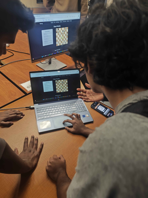
Pawnsy chess based social site, play analyze, improve chess. One group member, Vasanth made a skills API for users to track their chess progress so they can learn from there mistakes and improve.
Strengths:
- Clear Presentation
- The site was well explained during the presentation.
- Interactive Demo
- Allowing us to test the site and play chess against the AI bot was a great addition.
- Consistent Styling
- Most of the design is cohesive, creating a unified look.
Areas for Improvement:
- Game Manager Styling
- Consider updating the Game Manager’s design to better match the rest of the site.
- Color Palette
- Adding more color variety could enhance the visual appeal instead of relying solely on gray.
- User-Friendly Navigation
- Instead of redirecting users directly to the Chess Game Manager page, consider leading them to an introduction page that explains the site’s purpose.
Travel Planner
It’s a travel planner that helps users find accommodations, manage their checklists, book flights, and more.
Strengths:
- Engaging Feature Explanations
- The descriptions were clear and easy to follow.
- Being able to interact with some features made the experience more enjoyable.
- Well-Structured Presentation
- The presentation was brief but effective.
- Covering only half of the features allowed us to explore the rest independently.
- Consistent and Modern Styling
- The dark gray and neon blue theme creates a sleek, integrated look.
- Every feature follows the same design, maintaining visual harmony.
- Diverse and Useful Features
- The inclusion of APIs beyond basic post requests adds value.
- Interactive tools like the hospital location map and hotel finder stand out.
- Admin Role Enhancements
- Special privileges for admins improve management and oversight.
Areas for Improvement:
- Refining Admin Permissions
- Some admin privileges, like viewing user packing checklists, seem unnecessary.
- Consider limiting access to maintain user privacy.
- Design Consistency
- The main page’s purple background doesn’t match the rest of the design.
- Adjusting it to align with the dark gray and neon blue theme would improve cohesion.
- Fixing Broken Links
- Some buttons lead to 404 pages.
- Unused links should be removed or updated to avoid confusion.